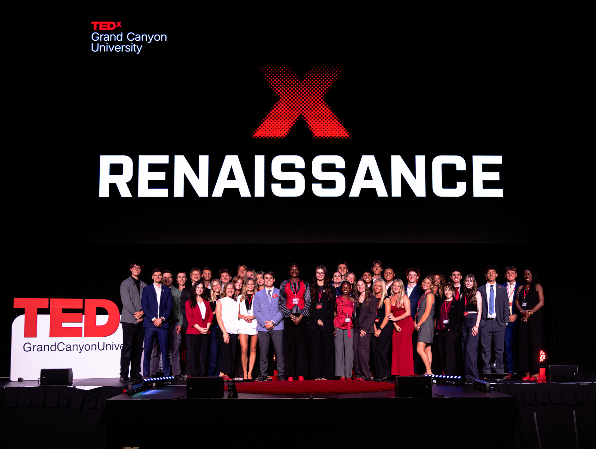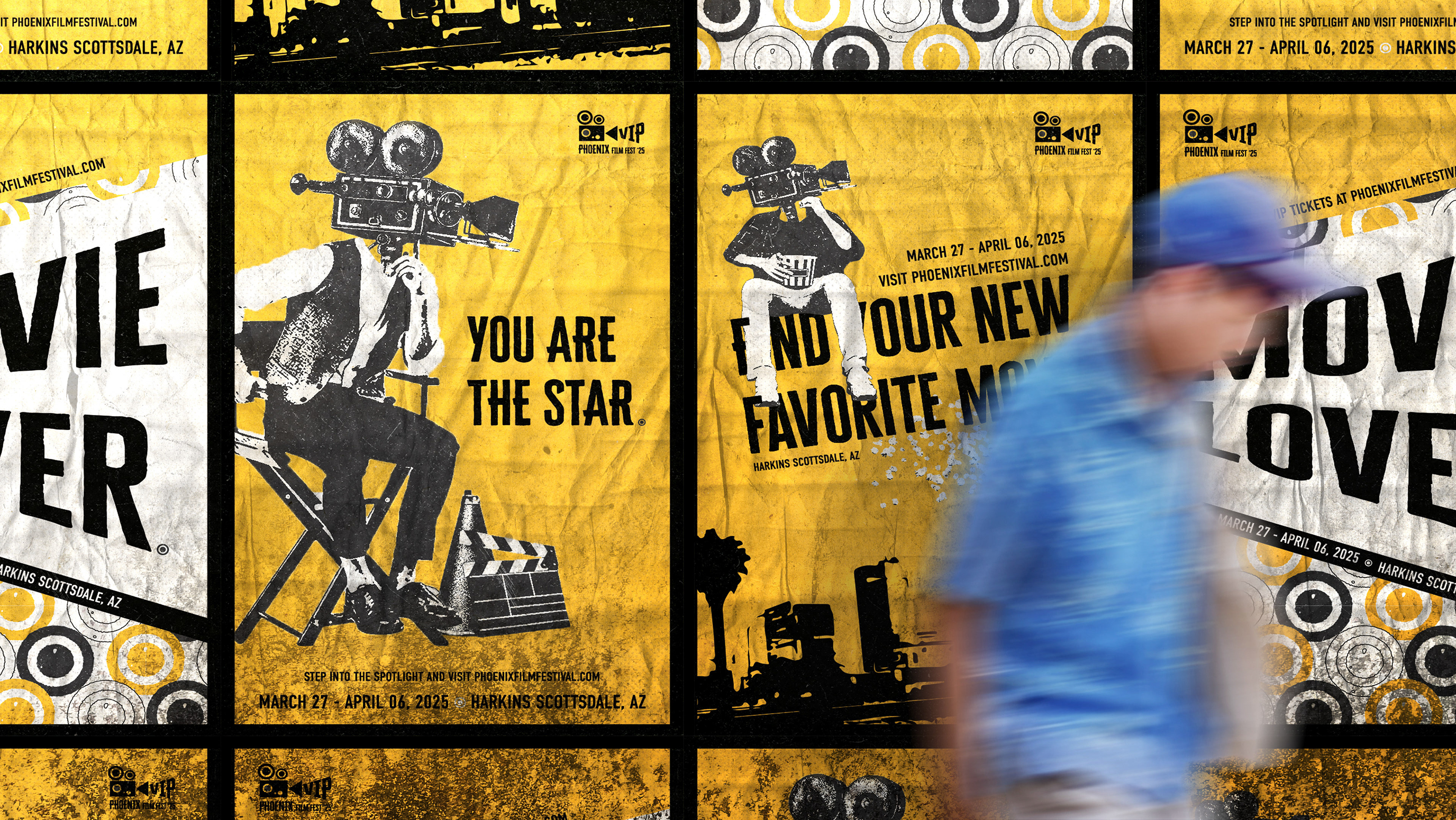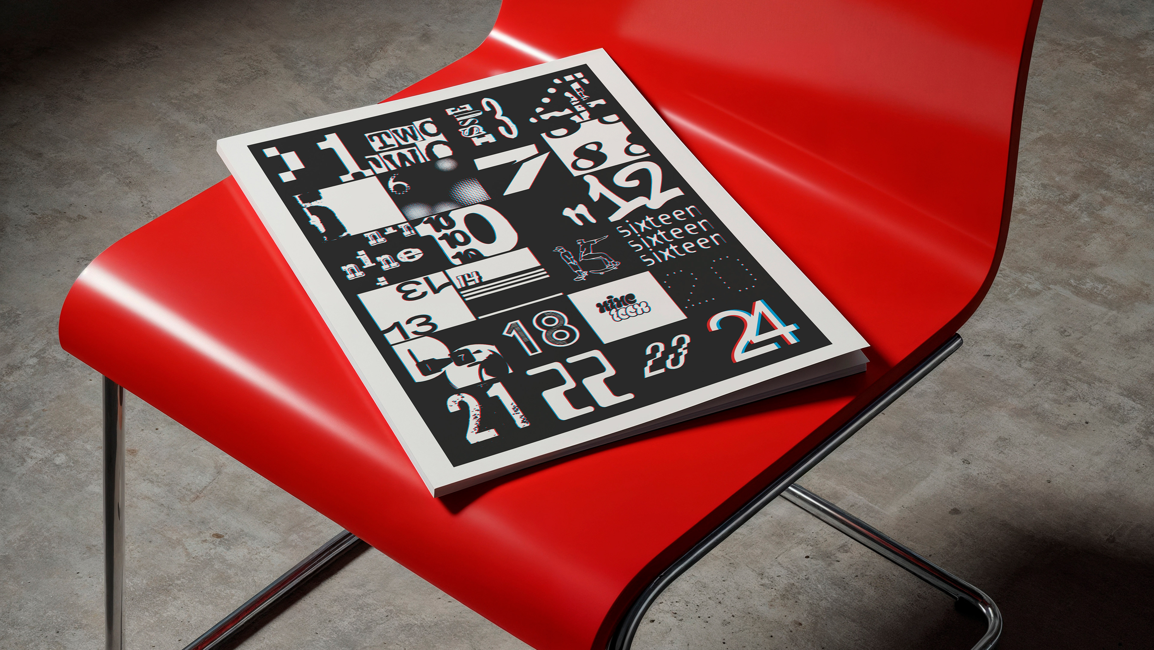
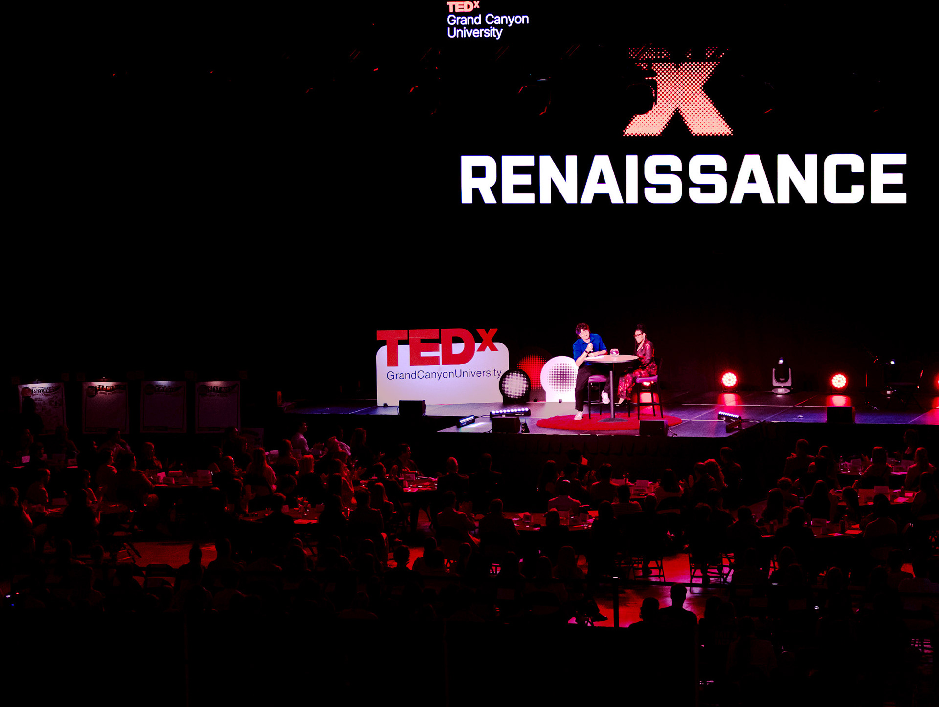
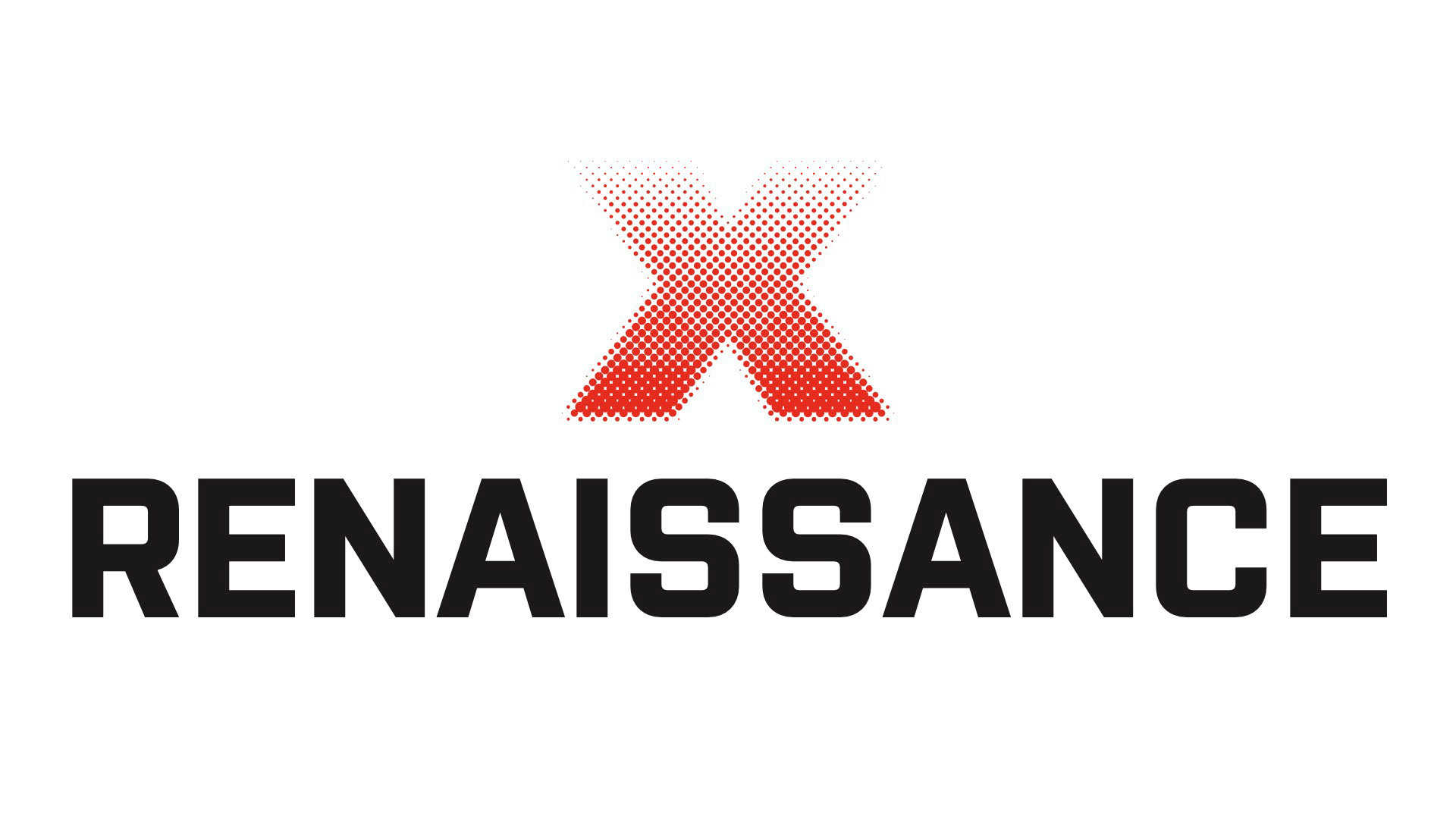
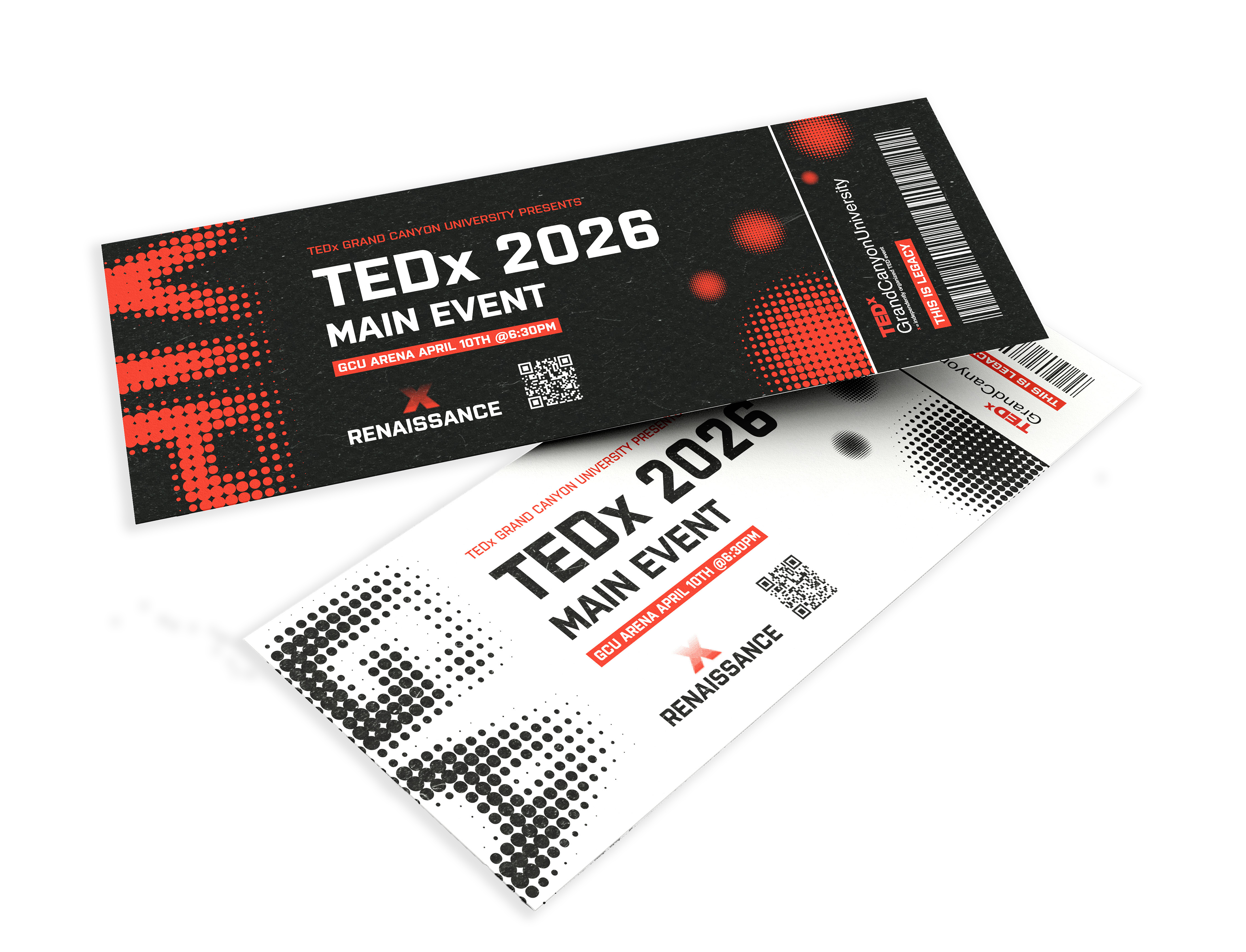
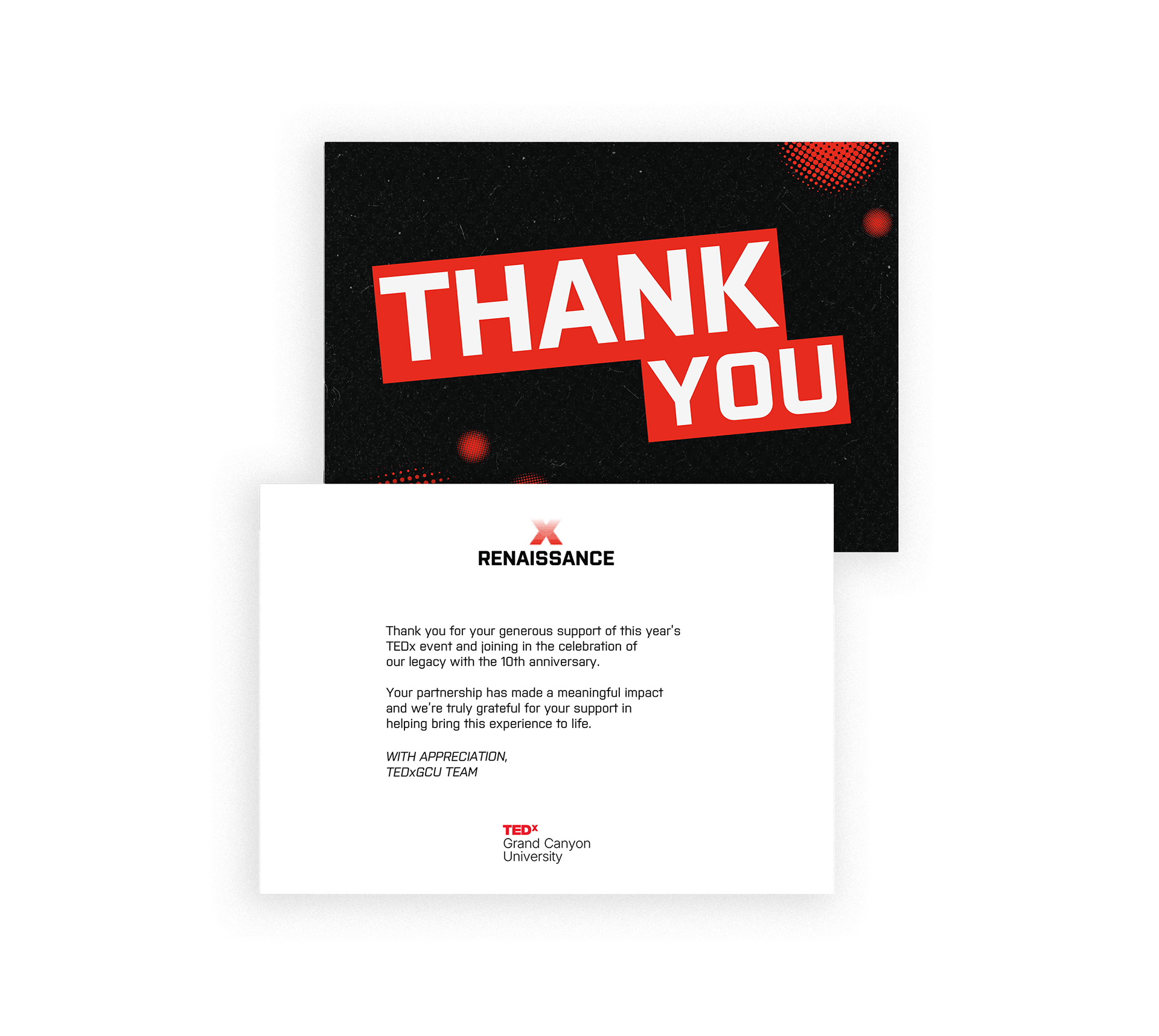
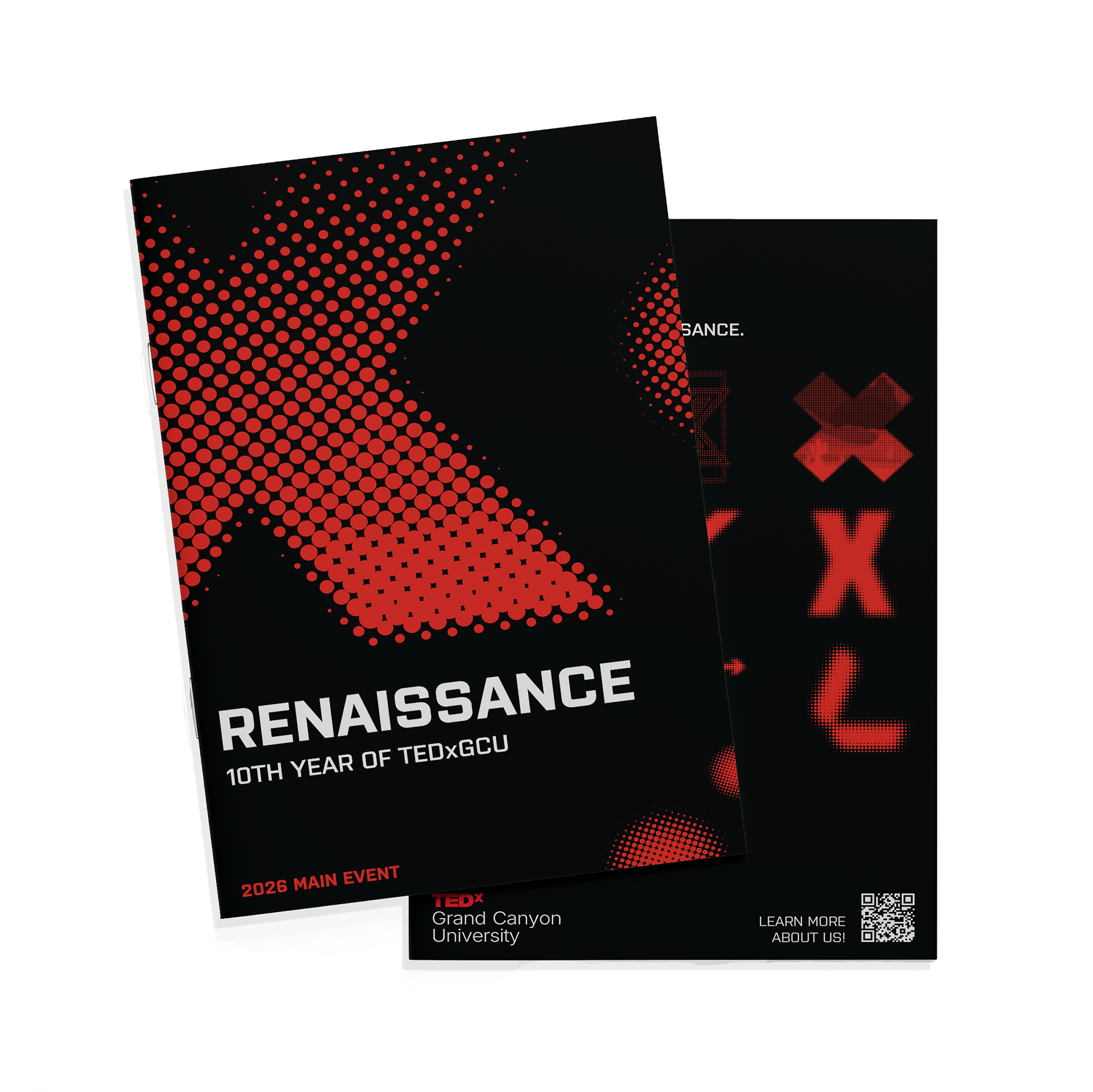
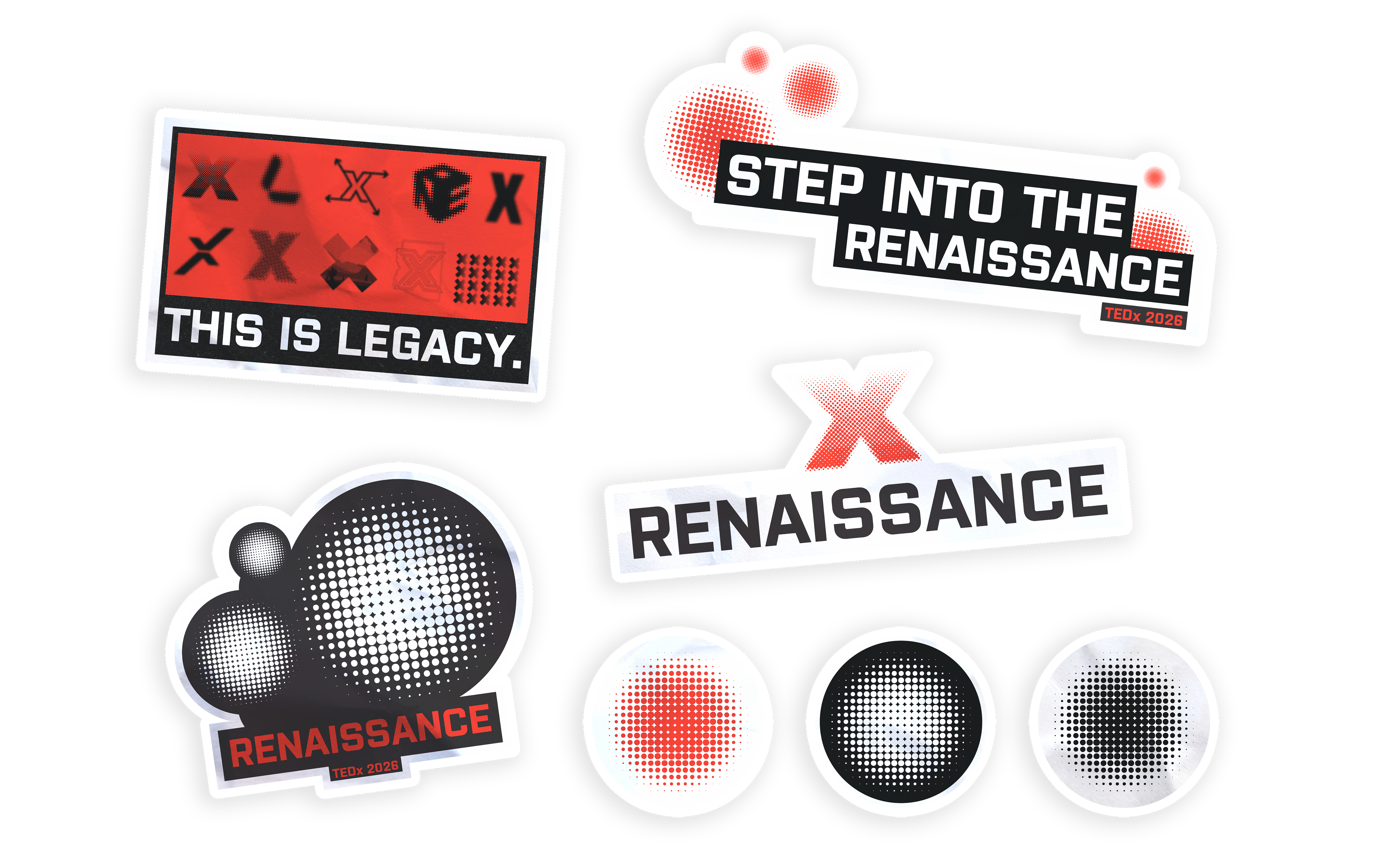
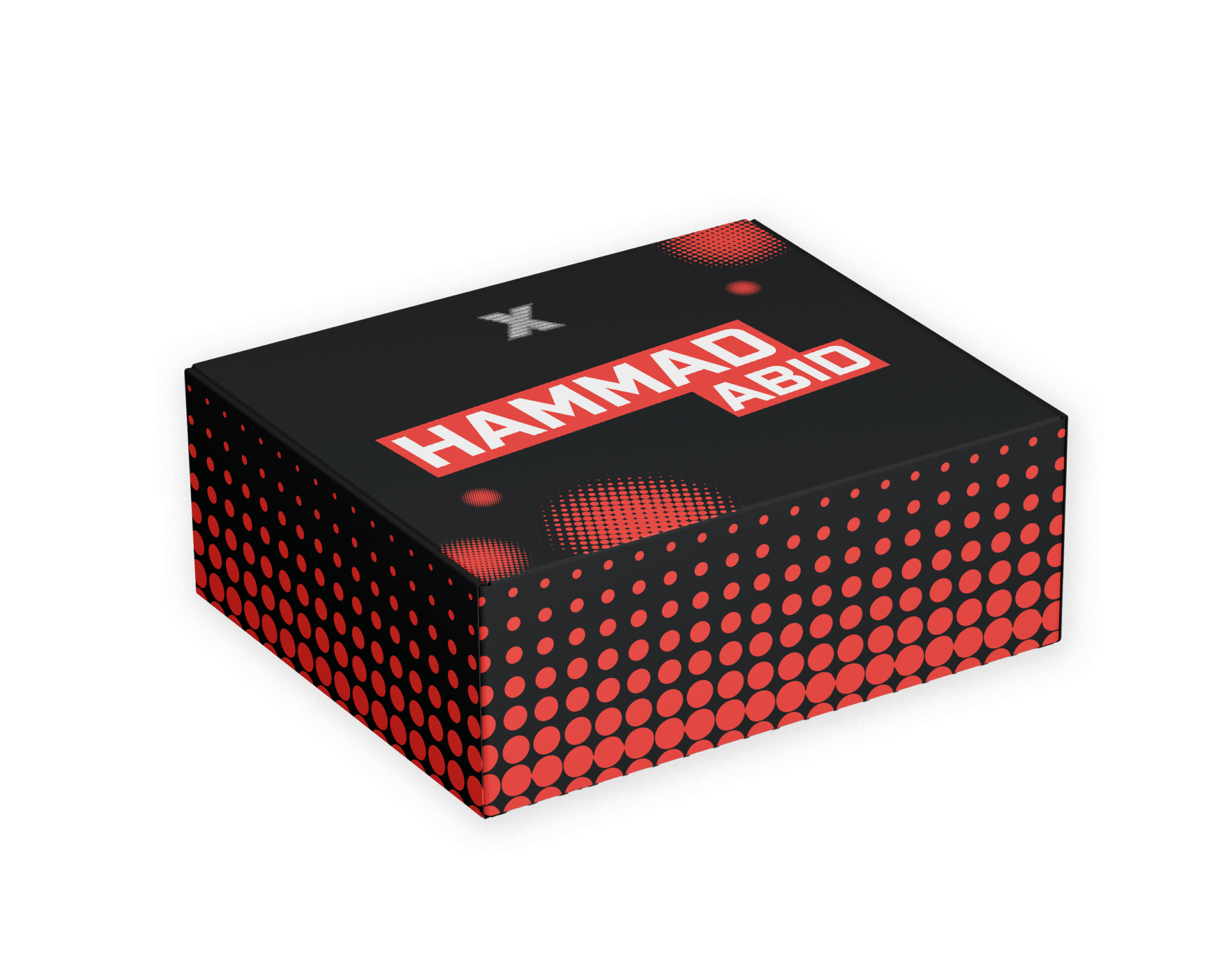
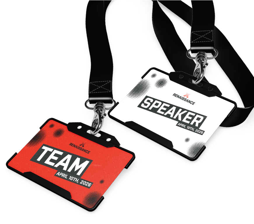
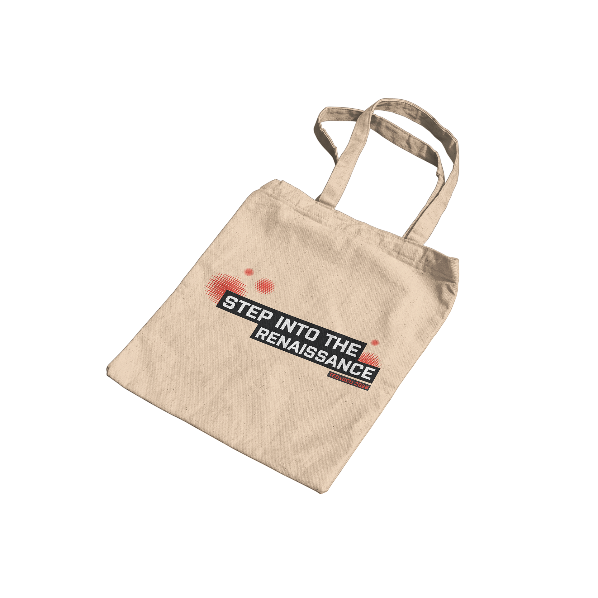
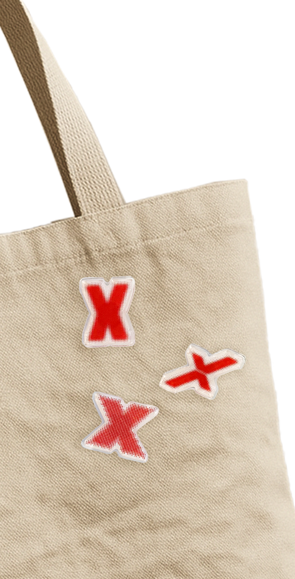
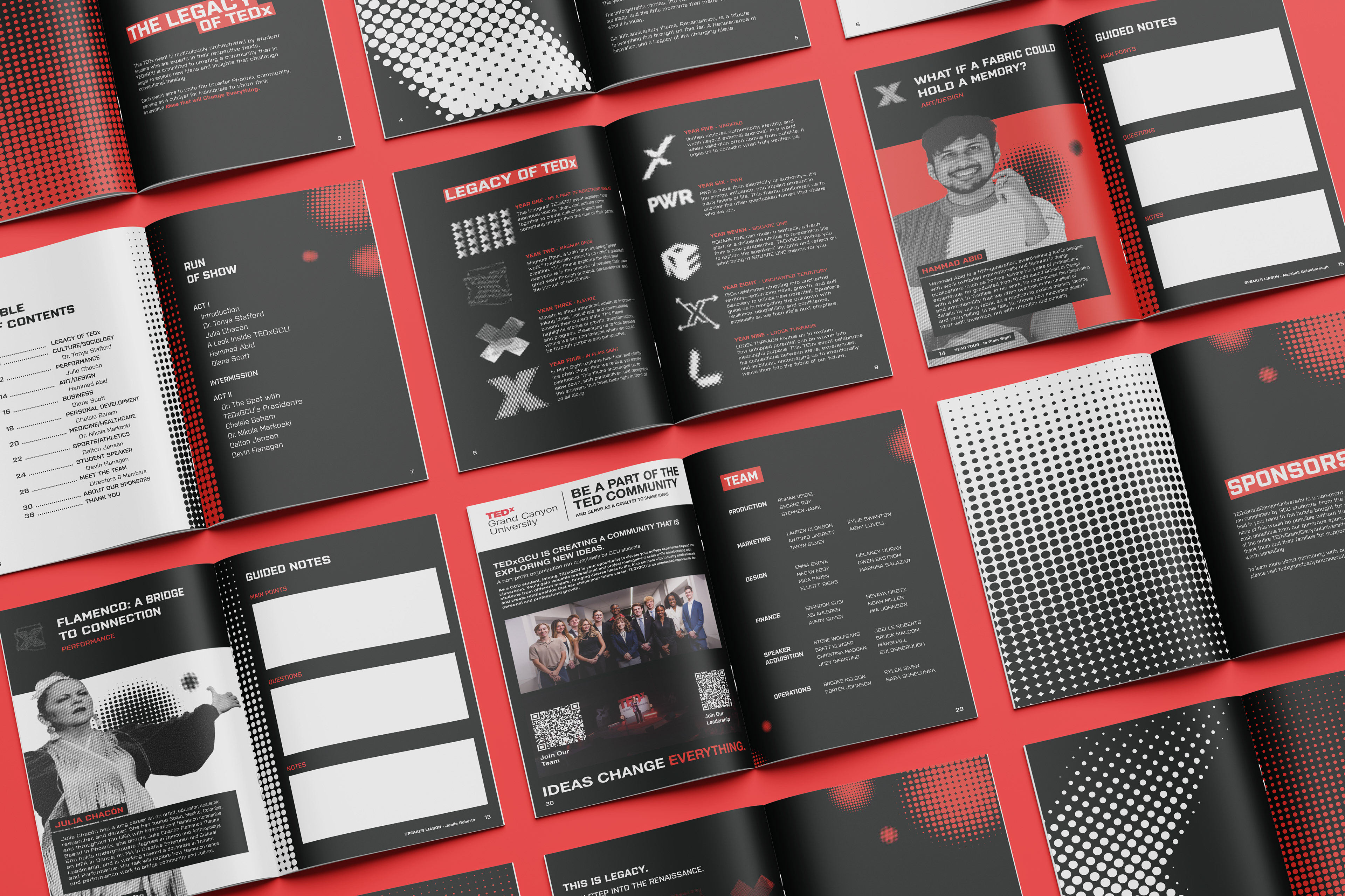
TEDxGCU is a student-led organization at Grand Canyon University operating under the mission of “Ideas Worth Spreading.” As TEDxGCU celebrates its 10th anniversary, our goal was to highlight a decade of impact through a visual “Renaissance”. A revival of past work brought into the present. The deliverables for this event were a new logo, revamping nine past logos, nine speaker posters, social media posts, stickers, pins, a tote bag, program, tickets, badges, thank you cards, giveaway boxes, and stage assets.
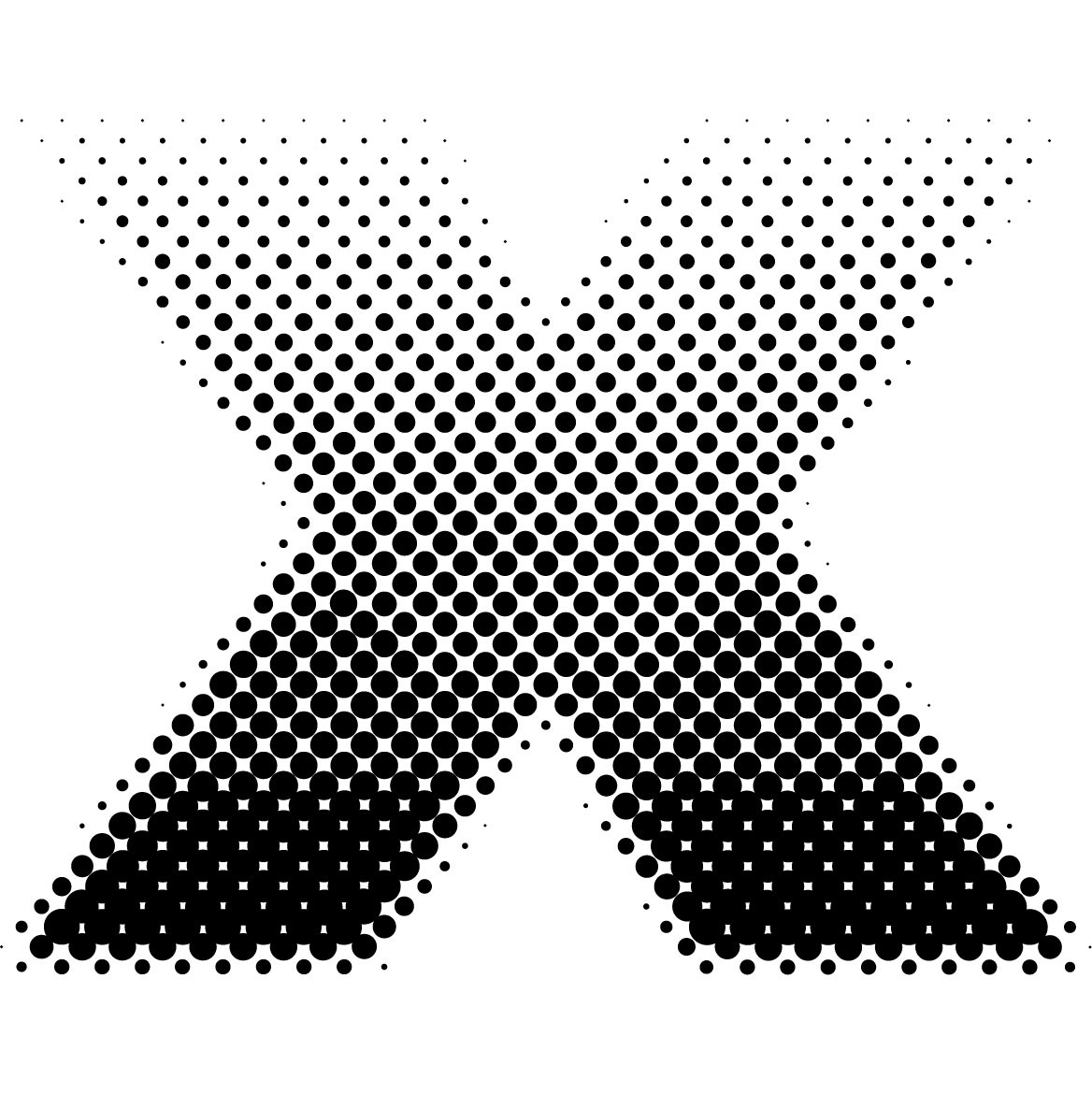
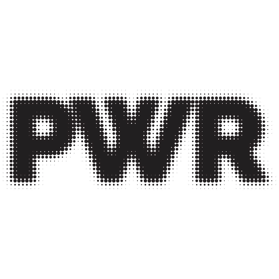
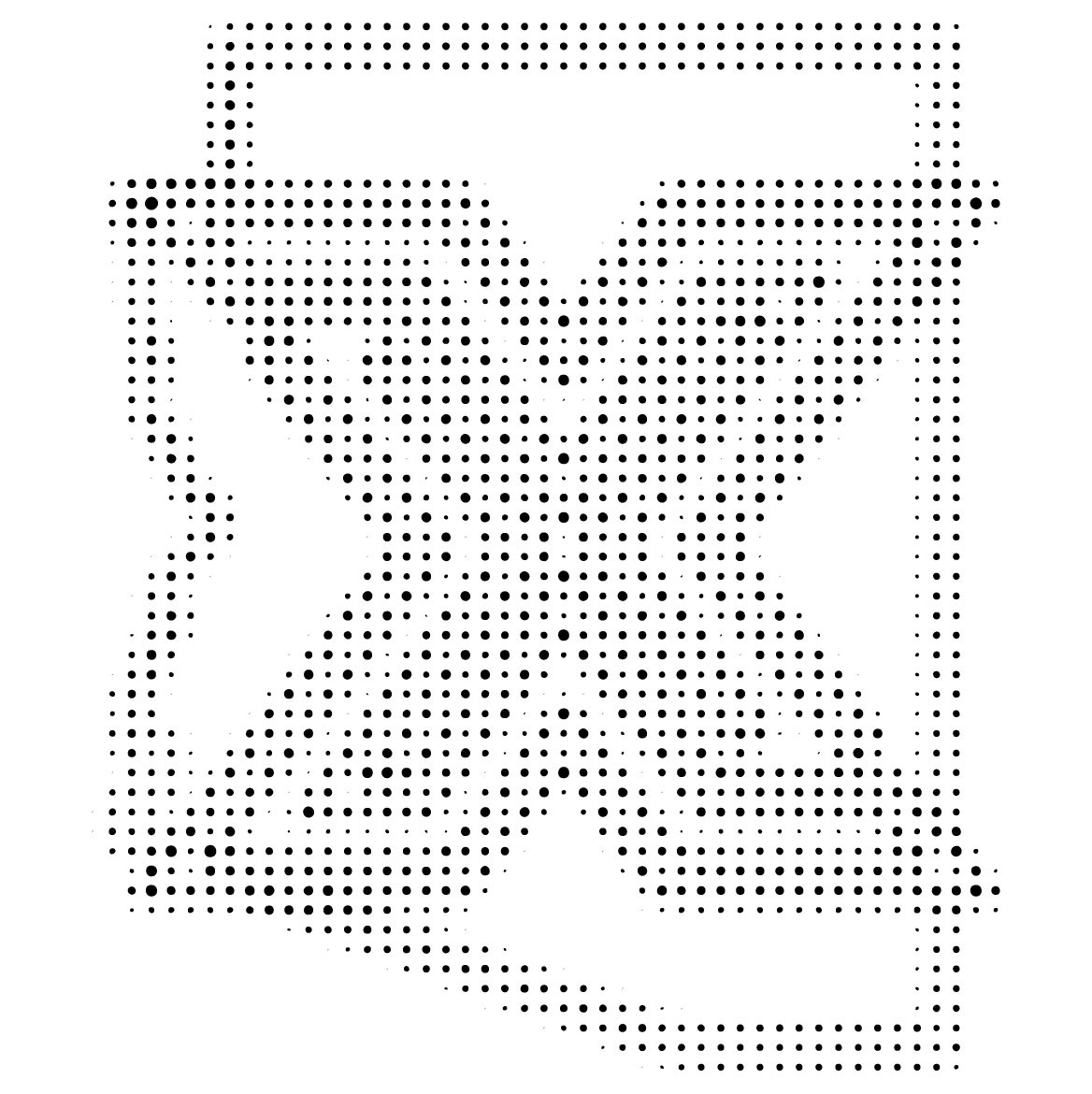
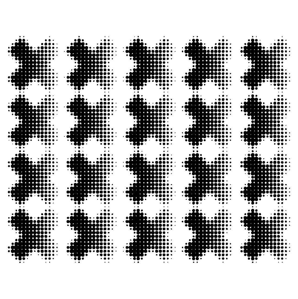
The initial brief shaped my approach, particularly the challenge of incorporating all nine past logos into a cohesive look. We needed to show off past events and somehow bring their designs into the present. From there, I began gathering inspiration and sketching concepts. The idea of a shift kept resurfacing. I wanted to show how each year shifts or transforms into another, all leading up to the renaissance.
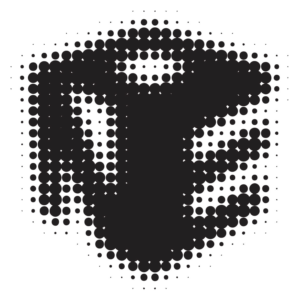
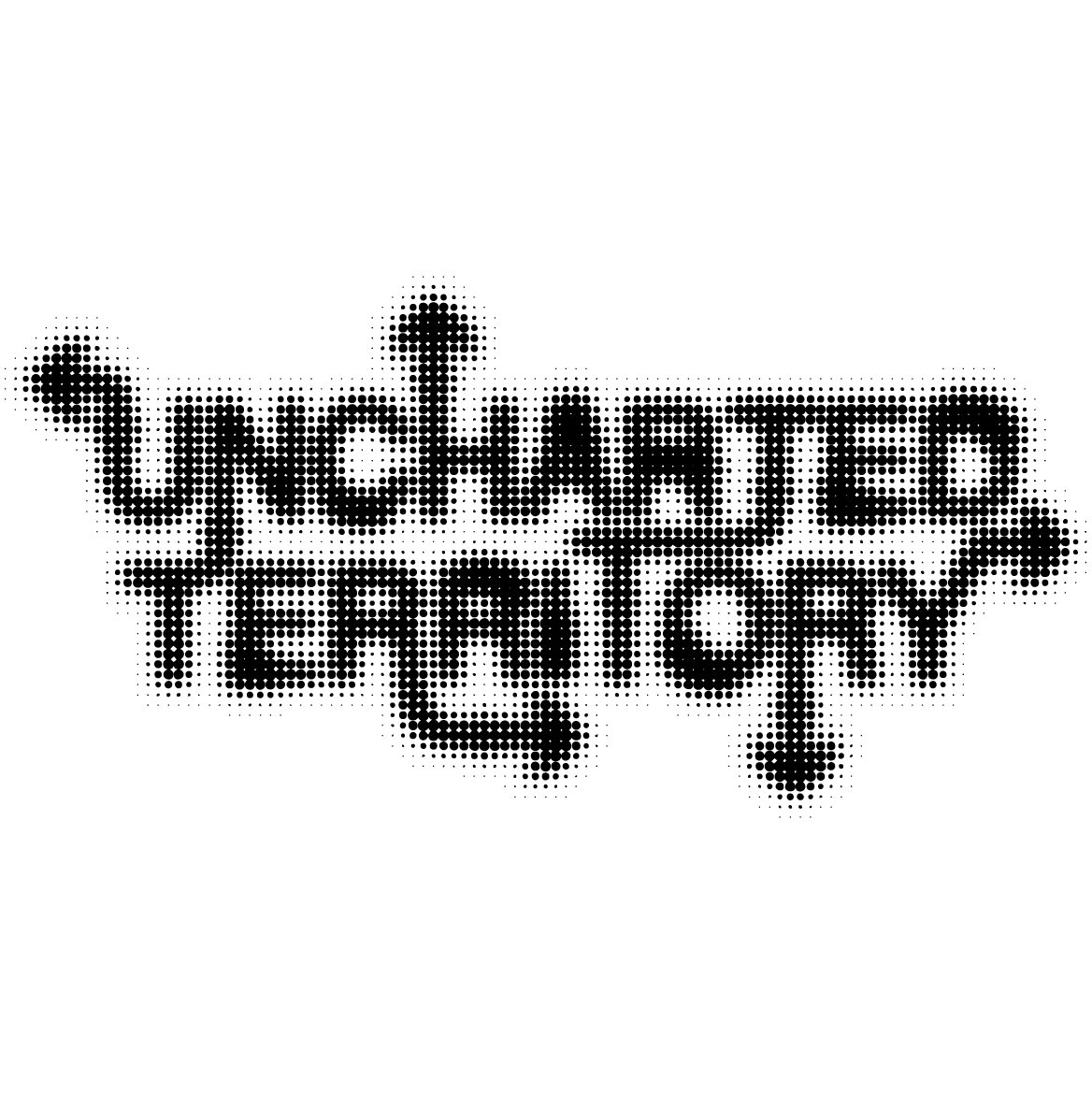
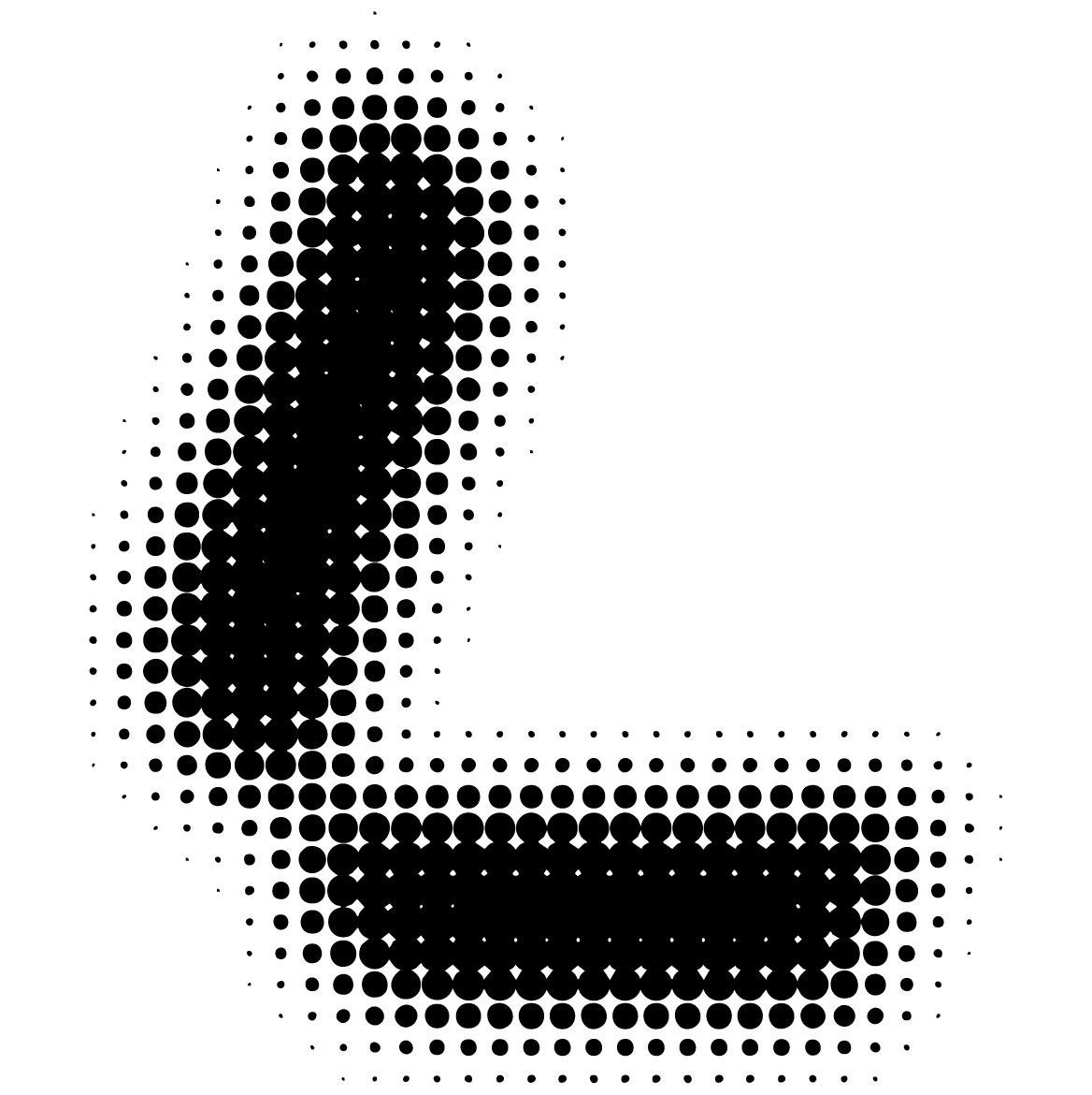
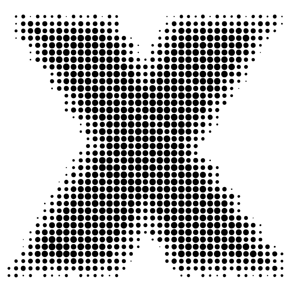
I explored ways to visualize that idea and landed on a halftone effect. The transformations were smooth, and its modern, minimal aesthetic allows TEDx’s history to shine. The traditional TED color palette of red, black, and white helped to keep a cohesive look between all the different years. Designing for a project of this scale was extremely rewarding in both knowledge and experience.
CREDITS:
This project would not have been possible without the close collaboration with Megan Eddy (Motion Designer), Owen Ekstrom (Copywriter), Elliot Riggs (Web Designer), and Olivia Barton (Project Manager).


All animations were made by Megan Eddy.
All animations were made by Megan Eddy.